
![]()
When climate deniers are desperate because the measurements don’t fit their claims, some of them take the final straw: they try to deny and discredit the data...
The years 2014 and 2015 reached new records in the global temperature, and 2016 has done so again. Some don’t like this because it doesn’t fit their political message, so they try to spread doubt about the observational records of global surface temperatures. A favorite target are the adjustments that occur as these observational records are gradually being vetted and improved by adding new data and eliminating artifacts that arise e.g. from changing measurement practices or the urban heat island effect. More about this is explained in this blog article by Victor Venema from Bonn University, a leading expert on homogenization of climate data. And of course the new paper by Hausfather et al, that made quite a bit of news recently, documents how meticulously scientists work to eliminate bias in sea surface temperature data, in this case arising from a changing proportion of ship versus buoy observations.
To illustrate the shenanigans of self-styled “climate skeptics”, take for example the following graph, which has been circulating for a while on climate denier websites. It beautifully illustrates two of the favorite tricks of climate deniers: cherry picking and deceptive trick graphics.
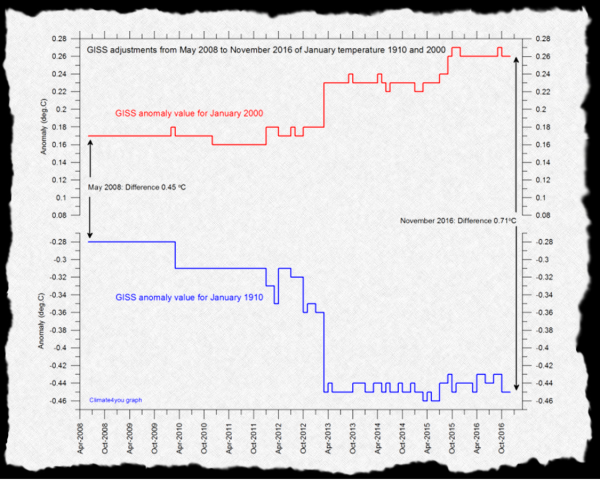
Fig. 1 Revision history of two individual monthly values for January 1910 and January 2000 in the GISTEMP global temperature data from NASA (Source: WUWT )
If you look at the black arrows, do you have the impression that the 0.71 ° C temperature difference is mainly due to data adjustments? Because the arrow on the right is three times longer than that on the left? Far from it – can you spot the trick? In the vertical axis, 0.3 ° C is missing in the middle! The adjustment is actually only 0.26 °C. Even that is quite a lot of course – and that’s because it is an extreme example. The January 1910 shown is the month with the second largest downward correction, obviously cherry-picked from the 1,643 months of the data series.
In the annual mean values and particularly for the temperatures since the Second World War, the corrections are minimal, as the following graph shows:
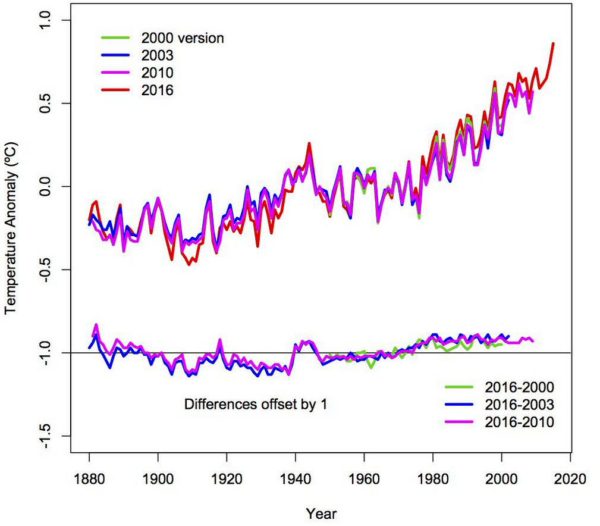
Fig. 2 Revision history of global temperature data set from NASA. Here, too, one can see that in 1910 the greatest correction occurred. (Source: Goddard Institute for Space Studies )
This graph must be familiar to anyone who works with the NASA data, because it is in the notes to the data on the NASA site (even interactive). Incidentally, Gavin already debunked the misleading representation in Fig. 1 last March on Twitter. Anyone who shows you Fig. 1 without also explaining the big picture as shown in Fig. 2 is trying to fool you.
A denier favorite is to suggest that NASA deliberately adjusts temperatures upward to exaggerate global warming. An absurd conspiracy theory, as demonstrated by the basic fact that the net effect of the data adjustments is to reduce global warming. The next figure shows this. If climate scientists were trying to exaggerate global warming they’d show you the unadjusted raw data!
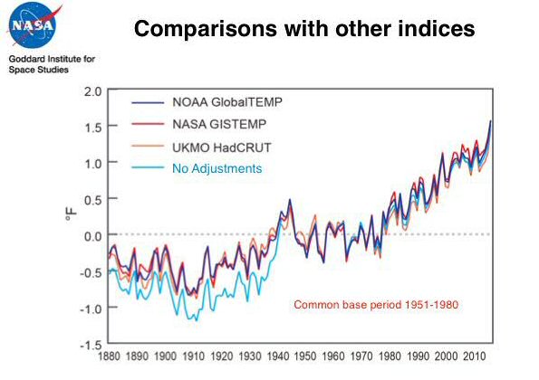
Fig. 3 The NASA data of global temperature compared to the uncorrected raw data (light blue) and two global temperature data sets from other institutes. (Source: Goddard Institute for Space Studies )
It is not surprising that you find such conspiracy theories on Anthony Watts’ sectarian blog WUWT, a place where climate science amateurs present earth-shattering insights to their echo chamber like: The CO2 increase is not due to burning fossil fuels, but to insects! Global warming is caused by the nuclear reactor in the Earth’s core! The warming of Antarctica comes from “waste heat from little pockets of humanity” there! The Greenland ice sheet can be at most 650 years old! (That’s obvious – how could the Vikings otherwise have grown crops there?)
A failed cooling forecast
The claim that the NASA data can’t be trusted has recently turned up at WUWT once again because we had compared these data to a cooling forecast made by two German climate denialists, and the comparison wasn’t exactly looking good for that forecast. Fritz Vahrenholt and Sebastian Lüning, both former employees of Europe’s largest single CO2 emitter RWE, had made this forecast of imminent cooling in their 2012 book “Die kalte Sonne” (The cold sun), where this forecast is shown in relation to the HadCRUT surface temperature data in running mean over 23 months.
So if they don’t like the fact that we compared their forecast to NASA’s GISTEMP data, let’s just do it with the HadCRUT data.
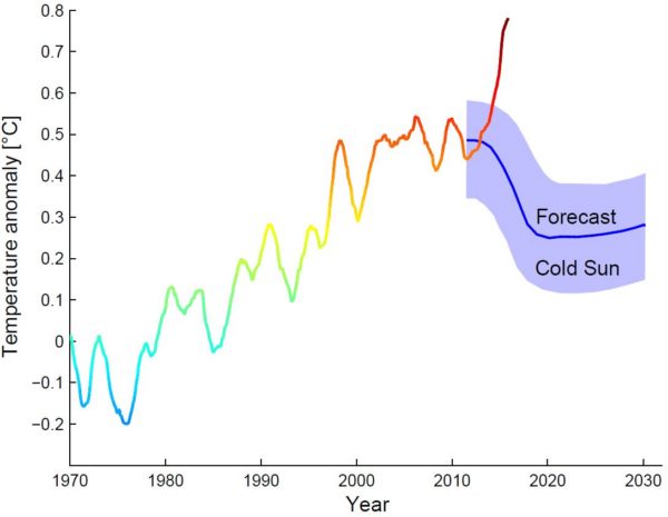
Fig. 4 The “Cold Sun” forecast of Vahrenholt and Lüning compared with global surface temperatures of the British Meteorological Service (HadCRUT data), moving average over 23 months to end of October 2016. Graph: Prof. Stefan Rahmstorf, Creative Commons BY-SA 4.0 .
Hmm. Still not so convincing for the cold-sun forecast.
Thus in defense of their forecast at WUWT, Vahrenholt and Lüning have therefore applied three tricks which reduce the discrepancy of data and forecast.
- They are no longer taking a moving average over 23 months but over 37. This reduces the observed warming since 2011 (the start of their forecast period) to the end of the data curve from 0.34 to 0.22 °C.
- They now no longer take surface temperatures but satellite data for the troposphere (RSS data). We could say a lot about the problems of these data – but we will leave that to the senior scientists behind the RSS data, Carl Mears, who explains in this video why the surface data are more accurate. Above all, however, only ground-level temperatures are directly relevant to us humans. We tend to dwell on the Earth’s surface and not in high-altitude balloons. The fact that Vahrenholt and Lüning are now suddenly switching from the original surface data in their book to the less accurate and hardly relevant tropospheric data can only have one reason: this makes their forecast look somewhat less wrong. Specifically, it reduces the observed warming further from 0.22 to 0.13 °C.
- In their new graph, the forecast curve does not start at the level of the measured data curve in 2011, but has been shifted upwards – so the data don’t stick up so far out of the forecast interval at the end.
But even with these three changes compared to the original forecast graph in The Cold Sun, Vahrenholt and Lüning don’t succeed in preventing the observed temperature curve from rising out of their forecast interval. They try to belittle that with the argument that last month’s value just returns to the top edge of the forcast interval – which is irrelevant, however, because this forecast does not apply to individual months, which are always strongly scattered.
The second step alone – just switching from surface to the satellite data – would not have helped them much by the way, bringing only a reduction from 0.34 to 0.30 °C. One can guess that this is why Vahrenholt and Lüning have also extended the smoothing period from two to three years. But let’s accept this longer averaging period as a legitimate choice, since the forecast applies to the medium-term climate evolution and not short-term fluctuations, so that the latter can be filtered out by smoothing. Using a period of three years instead of just two will take out El Niño better. With the 37 months smoothing period the comparison looks as follows:
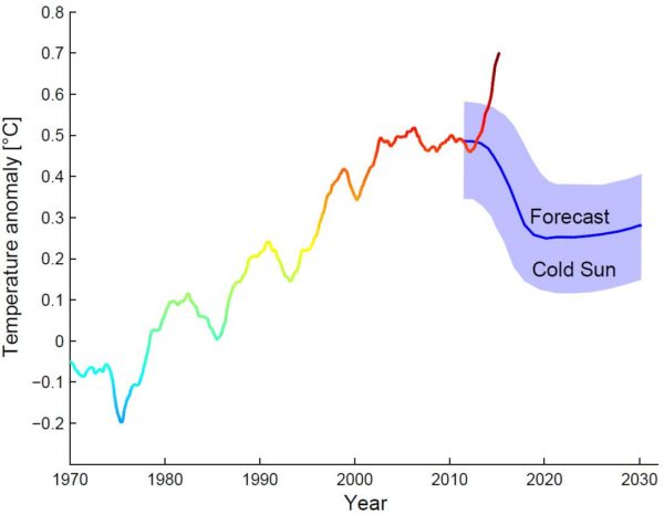
Fig. 5 The “Cold Sun” forecast of Vahrenholt and Lüning compared with global surface temperatures of the British Meteorological Service (HadCRUT data), running average over 37 months. Graph: Prof. Stefan Rahmstorf, Creative Commons BY-SA 4.0.
This still clearly falsifies the cooling forecast of Vahrenholt and Lüning.
Conclusion
I have discussed this example here in some detail because it exemplifies the methods of so-called “climate skeptics”. People like Vahrenholt and Lüning trust that a layperson won’t notice their various tricks. An outsider can ultimately hardly recognize these unless he studies intensively the available data and scientific literature. However, applying some common-sense criteria can give a layperson a clear indication of the lack of credibility: the source is a “climate skeptics” website, there is no research institution and no professional climate scientists behind these claims, and there is no peer-reviewed publication with the cooling forecast, rather it is directed exclusively at a lay audience. Finally there is a connection of the authors to the fossil energy business.
As in professional journalism, there are several levels of quality assurance in professional science. A long study and training time, which conveys methods and ethics (like the search for truth and the continuous questioning of own assumptions). The standards of good scientific practice (non-compliance, such as manipulation of data, can cost a scientist their job and future prospects.) The reputation as the greatest asset of the scientist and his research institution, that is rapidly lost when making wrong claims. Peer review, i.e. the critical assessment of scientific publications (and even institutions) by independent third parties (mostly competitors). And last but not least, the culture of critical, open debate, which is very much alive e.g. at conferences, which will quickly identify most problems or mistakes.
None of this is infallible, and professional scientists sometimes make mistakes. For this reason, one should not necessarily believe every individual statement by a scientist, not even each peer-reviewed publication. It is better to base ones assessment on the bigger picture. There is good reason why every few years, hundreds of climate scientists from around the world voluntarily and unpaid tackle the big task of sifting through the scientific literature and debating it and summarizing the state of knowledge in the reports of the IPCC. There has long been an overwhelming consensus about the basic facts of global warming. Anyone who finds serious, defensible counter-evidence would quickly become famous – a place in the top journals Nature, Science or PNAS would be assured. The likelihood that you will find a scientific sensation on a shrill layperson website like WUWT is infinitely smaller than that you are simply being fooled there.
by: stefan @ 16 January 2017
source: http://www.realclimate.org/
original story HERE
To help do something about the climate change and global warming emergency, click here.
Sign up for our free Global Warming Blog by clicking here. (In your email, you will receive critical news, research, and the warning signs for the next global warming disaster.)
To share this blog post: Go to the Share button to the left below.
Be the first to comment
Sign in with