

Updated spiral of global temperatures: as expected, after 12 record months in a row, the El Niño boost is receding pic.twitter.com/CD4LoaYtOX

credit: Courtney Menard
Several months ago, climate scientist Ed Hawkins made headlines with a stunning animated visualization of the change in global temperature over the past 150 years...
At the time, he told The Washington Post that the graphic was an attempt to “communicate in a different way,” and his efforts seemed to have worked: The visualization was shared thousands of times and covered by numerous news outlets touting its simple and effective demonstration of the progression of global warming over time.
Now, scientists have developed two new visualizations, released Wednesday, intended to complement Hawkins’s original graphic. The result is an even clearer picture of not only the change in global climate but the undeniable human influence on its progression.
Hawkins’s original graphic took monthly temperature data going back to the year 1850 and plotted it over a series of concentric circles representing incremental increases in global temperature. The result is a kind of spiral effect, with the warming temperatures expanding into the outer circles over time.
The additional graphics, which were created by scientists Malte Meinshausen of the University of Melbourne and Robert Gieseke of the Potsdam Institute for Climate Impact Research, utilize the same spiraling design as Hawkins’s original graphic. They show the change in carbon dioxide concentrations from 1850 on, and the change in our global carbon budget — that is, how many degrees above preindustrial temperature levels we’ve crept over time. The global goal, as decided at last year’s United Nations climate conference in Paris, is to keep temperatures within 1.5 degrees Celsius of preindustrial levels, or 2 degrees at the most.
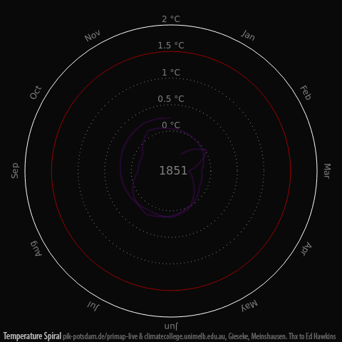
Global-mean temperatures since 1850. Redrawing the original spirals by Ed Hawkins. (Gieseke and Meinshausen (2016) Climate Spirals from emissions to temperatures, available at: www.pik-potsdam.de/primap-live/ or climatecollege.unimelb.edu.au/climate-spirals)
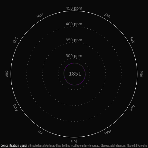
Global mean carbon dioxide concentrations since 1850. (Gieseke and Meinshausen (2016) Climate Spirals from emissions to temperatures, available at: www.pik-potsdam.de/primap-live/ or climatecollege.unimelb.edu.au/climate-spirals)

The use of the global carbon budget. (Gieseke and Meinshausen (2016) Climate Spirals from emissions to temperatures, available at: www.pik-potsdam.de/primap-live/ or climatecollege.unimelb.edu.au/climate-spirals)
When viewed at the same time as Hawkins’s temperature visualization, the three graphics provide a clear look at the relationship between atmospheric carbon concentrations and rising temperatures, as well as how close we’re getting to blowing through our 2-degree climate goal.
Meinshausen and Gieseke said they came up with the idea to build on Hawkins’s work at the U.N. climate change conference in Bonn this past May.
“One motivation to represent the carbon budget and concentration data in the same visual language was to show people the connection,” Meinshausen told The Post by email. “Global temperatures do not simply ‘spiral’ out of control by themselves. There is a cause for that. And that cause is predominantly our continuous use of fossil fuels. Thus, visualising the cause effect chain from emissions to concentrations to temperatures was an important motivation.”
But just as the spirals illustrate the profound influence that human activity has had on global warming, they also drive home the idea that we still have the power to combat future climate change, Gieseke pointed out. The spirals clearly suggest that if greenhouse gas emissions are halted and global carbon concentrations are allowed to stabilize, then global warming will ultimately plateau.
Of course, this is a fact that humans have been aware of for quite some time — and the spirals may actually have the greatest impact when they’re considered within the historical context of all the climate research that has taken place since 1850.
“It is … worth reflecting about how long we have understood the link between carbon dioxide and global temperatures, which is highlighted in these new spirals,” Hawkins said in an email. “In 1861, near the start of the animations, John Tyndall demonstrated that carbon dioxide was a greenhouse gas. Not long after, in 1896, Svante Arrhenius made the first estimate of how much global temperatures would increase if carbon dioxide concentrations were doubled. Then in 1938, Guy Callendar first showed that both atmospheric carbon dioxide concentrations and global temperatures had measurably increased.
“In the 78 years since then, both carbon dioxide concentrations and global temperatures have continued to rise,” he continued. “2015 was the first year that was more than 1 degree Celsius above pre-industrial levels, with 2016 likely to be hotter still.”
In other words, without concrete emissions-reducing action — and soon — we can expect those graphics to keep spiraling into the future. In fact, as we pointed out in our coverage of the original temperature spiral, Hawkins has published research to suggest that we could actually cross the 2-degree threshold in the next 45 years if humans continue emitting greenhouse gases at high levels.
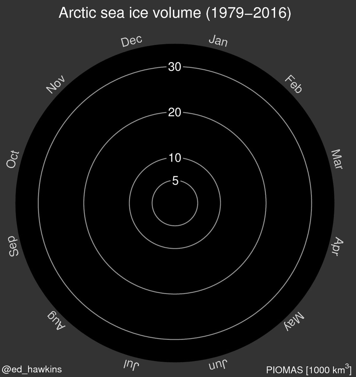
In the meantime, the popularity of the original temperature visualization has prompted Hawkins to produce several other climate-related spirals, including one on the decline of Arctic sea ice volume since the 1970s.
Meanwhile, in the Arctic, sea ice volume is at a record low for the time of year according to PIOMAS. pic.twitter.com/ig2X5MXcCg
It may be the best strategy for engaging with the public on an issue that often is challenging to explain in an exciting way. At a time when climate science communication efforts are often viewed as dense or difficult for general audiences to understand, these types of striking graphics may help climate scientists connect with the public in a way that is both clear and attention-grabbing.
“The visual beauty of the spirals is important to reach people who normally do not look at scientific graphs of data,” Meinshausen said.
And Gieseke added, “It’s always a challenge to compress complex research topics into simple accessible visualizations, but I believe that they help both the general public and expert researchers to understand scientific concepts. And the bottom line is actually a hopeful one: Our emissions from using fossil fuels are a main cause for rapid climate change — but it is in our hands to limit it if we act quickly.”
2016
source: https://www.washingtonpost.com/
original story HERE
To see our most current positions, opinions, comments, agreement or disagreement with this article, and/or possible criticisms related to the subjects or facts raised in the above article, click here. Then look for those subjects in the navigation links at the top the page. To learn about more about global warming, climate change or greenhouse gases as well as the causes, consequences, solutions, definitions, facts and tipping points related to these subjects, click here.
To automatically be emailed a summary of the latest news on global warming, sign up for our Global Warming Blog by clicking here. (Put your email address in the Global Warming Blog Subscribe box at the bottom right of the page.)
To sign a critical petition for declaring a national and international global warming State of Emergency, click here!
To help do something about the climate change and global warming emergency, click here.
Sign up for our free Global Warming Blog by clicking here. (In your email, you will receive critical news, research, and the warning signs for the next global warming disaster.)
To share this blog post: Go to the Share button to the left below.
Be the first to comment
Sign in with